Maximizing Growth at Couchsurfing 🌱
The Focus: User Acquisition
Couchsurfing requires a large and active community to be successful - how do we ensure it continues to grow and thrive?
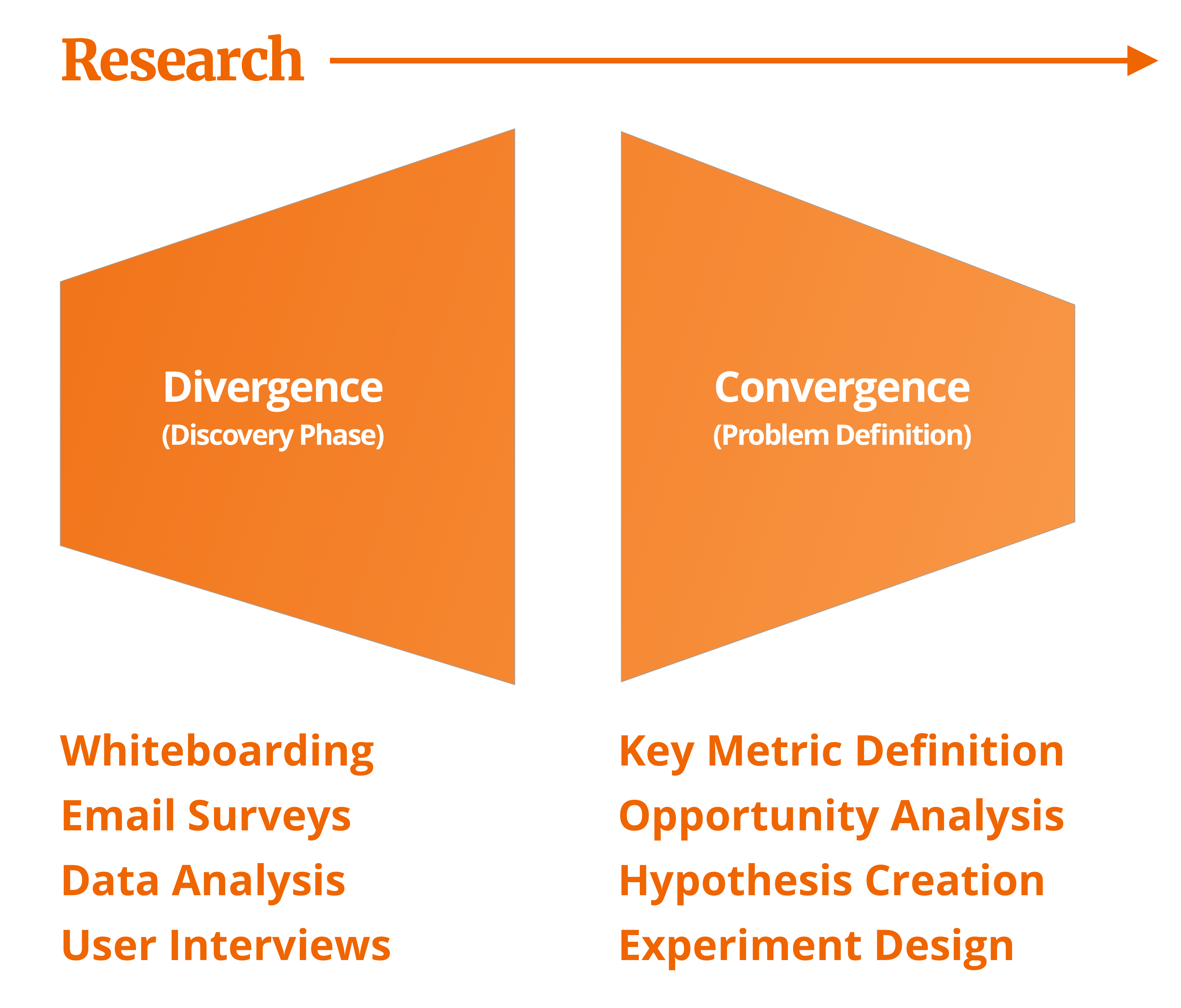
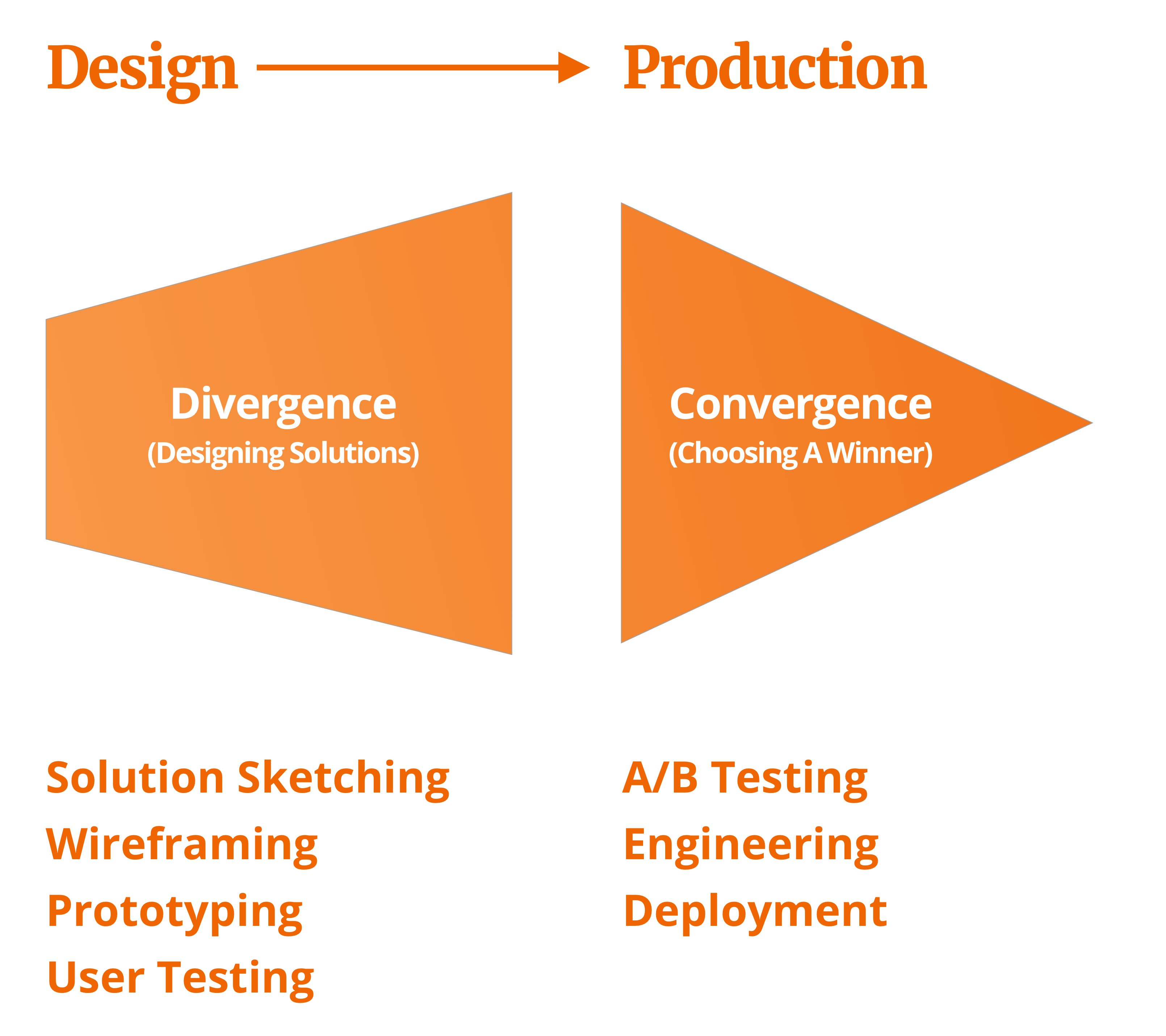
In the above diagram, I map out the design thinking process we followed to victory on this project.
Preliminary Research
Kicking off the new focus on member acquisition was a data-gathering phase. We invited a few couchsurfers into the office for interviews, distributed a mass survey, and dove into our rich trove of analytics data.
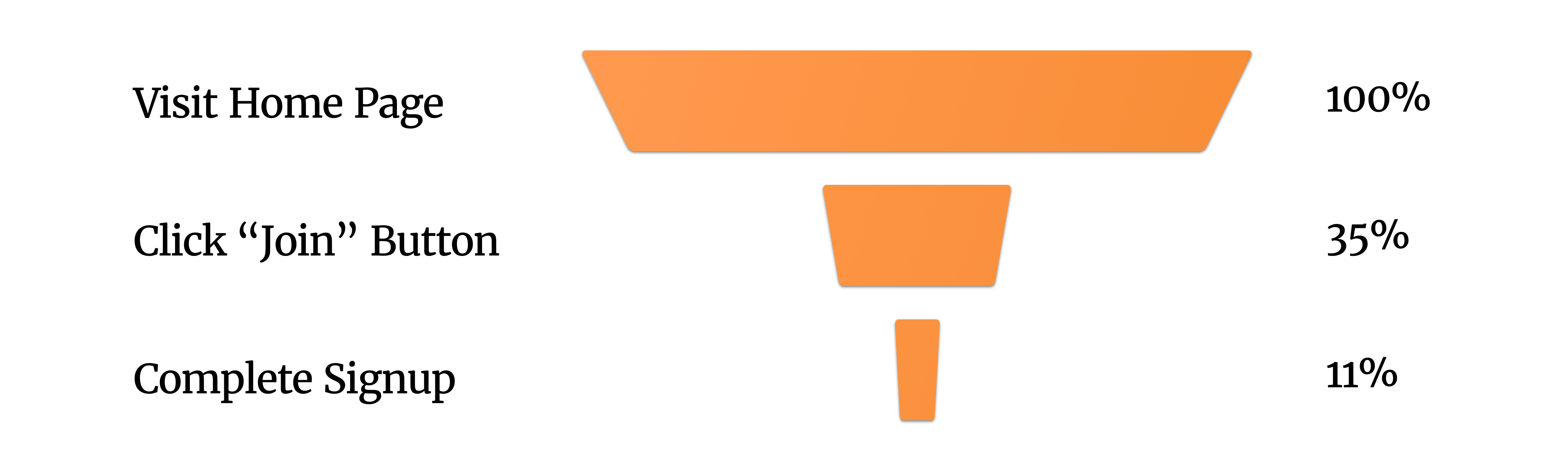
One startling statistic? Only 11% of people who reached the Couchsurfing homepage went on to become members. How can we get the rest to take that next step?
Our Hypothesis
If we replace the sign-up button on our home page with sign-up fields, then total conversion will increase.
Competitive Research
As a lean organization with only two designers and over 25 million members, we place an emphasis on analyzing our resource-rich competitors and adopting industry best practices. Through competitive research I found a number of sites that use their homepage as a sign-up page:
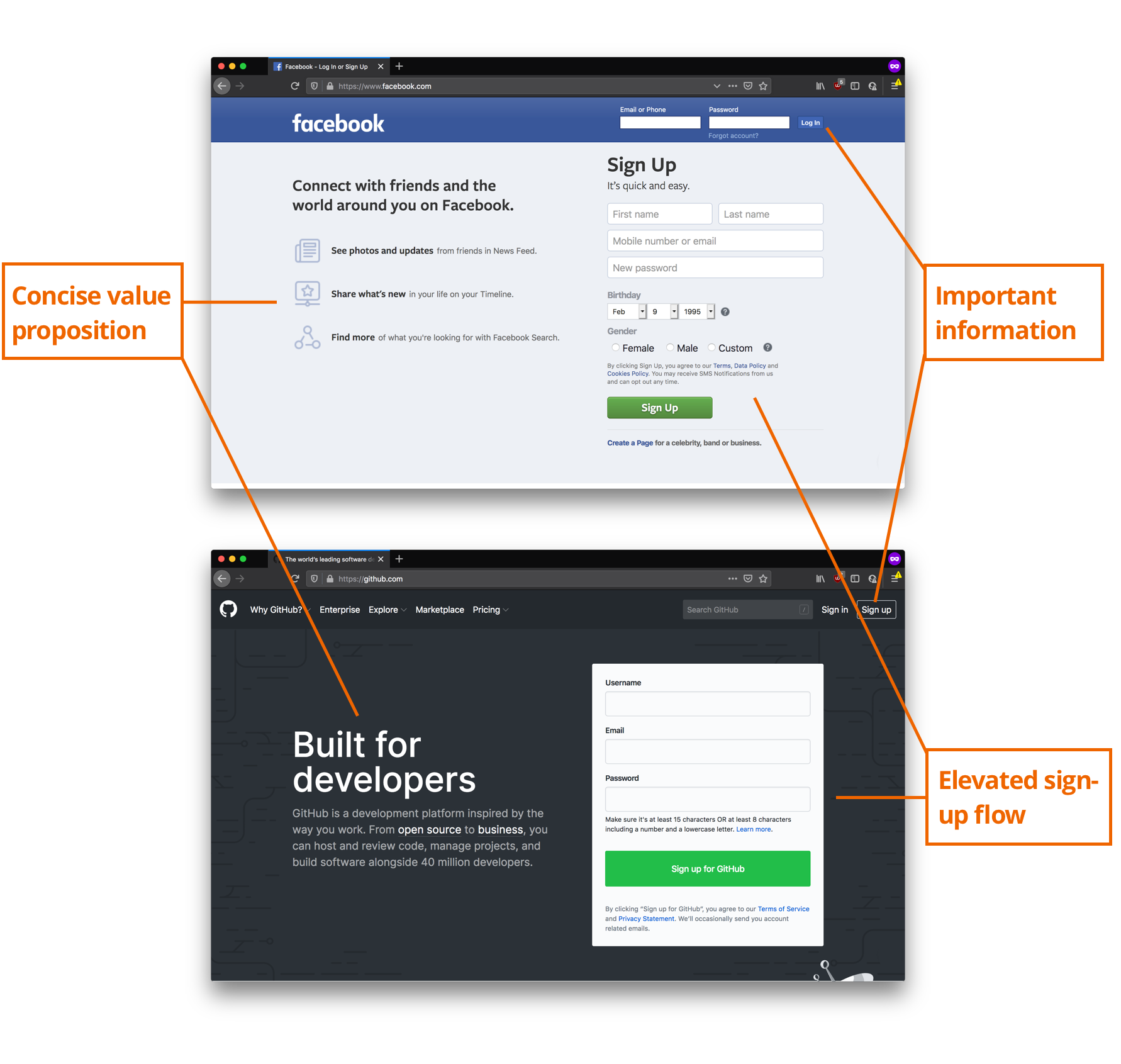
In contrast to these community-driven sites; our homepage overwhelmed members with testimonials, safety guides, and photos. This obfuscated our "Join" call-to-action.
Designing a Solution
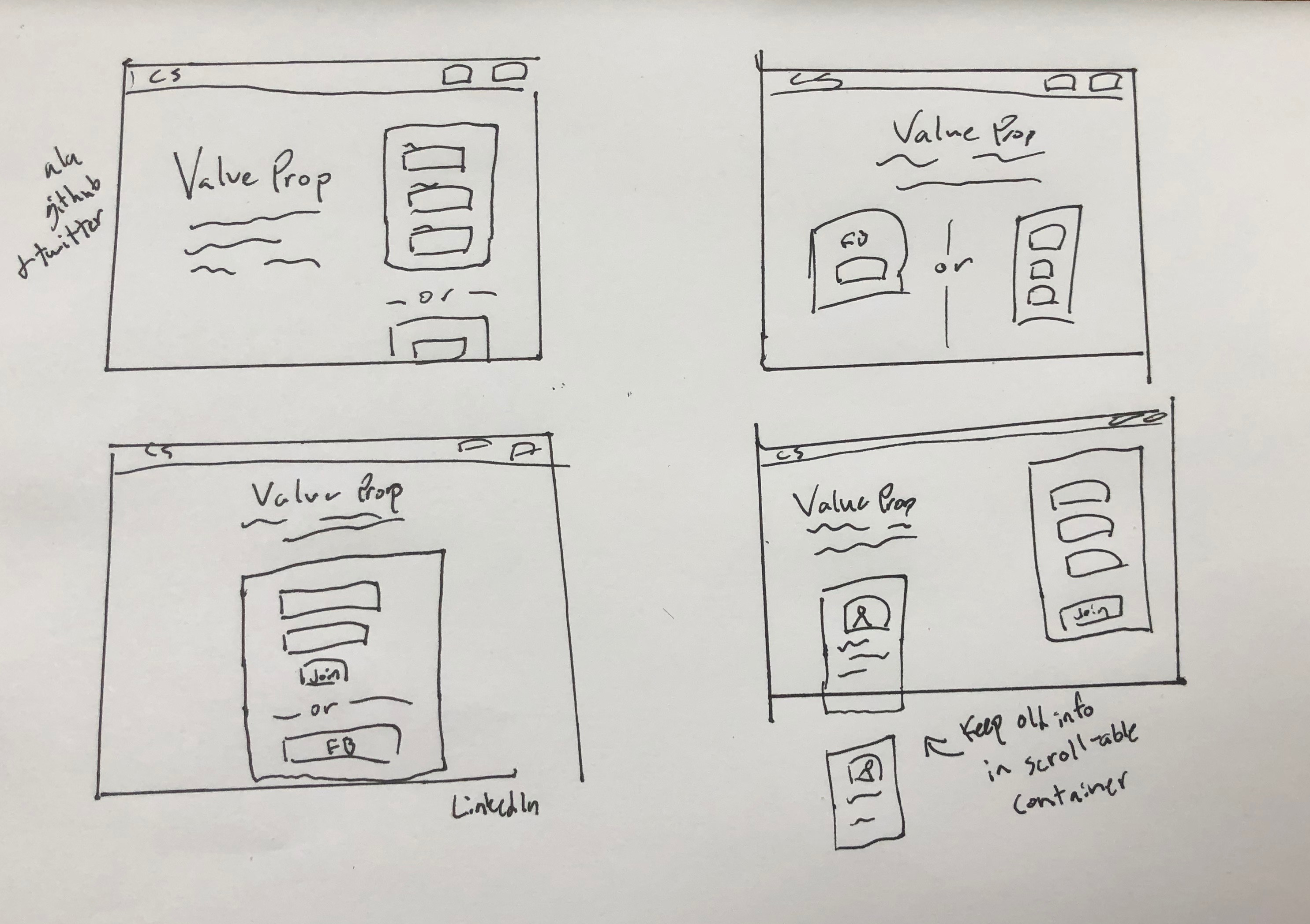
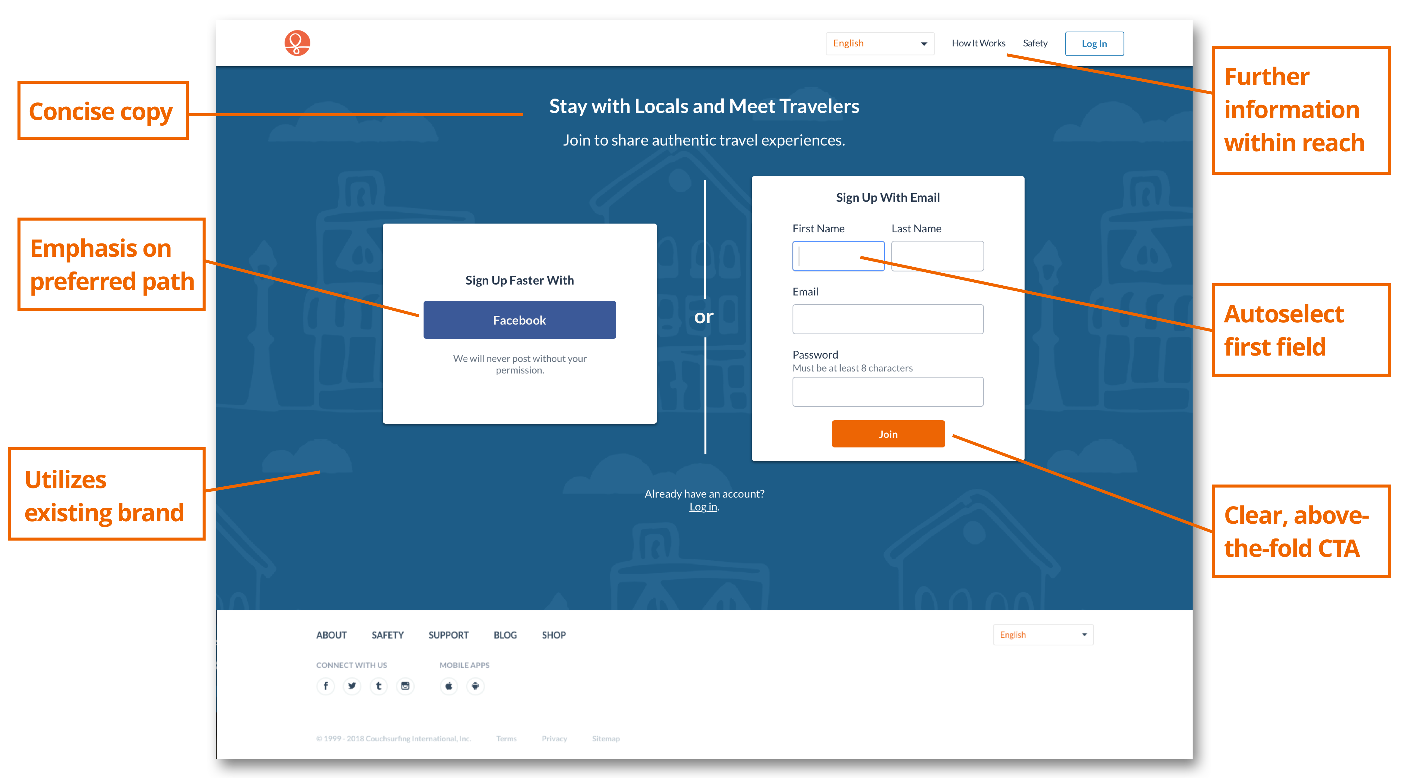
By dialing in the amount of information presented to prospective members, we were able to ensure that our most important information was properly highlighted and visible. My solution for another app I helped to design accomplished a similar goal.
Validation
On the qualitative side, I ran five user testing sessions collecting prospective member’s thoughts on a prototype of the new page. Then, I iterated based on their feedback.
For quantitative data, I worked with developers to launch an A/B test on our production server. I monitored sign-up conversions as well as key guardrail metrics.
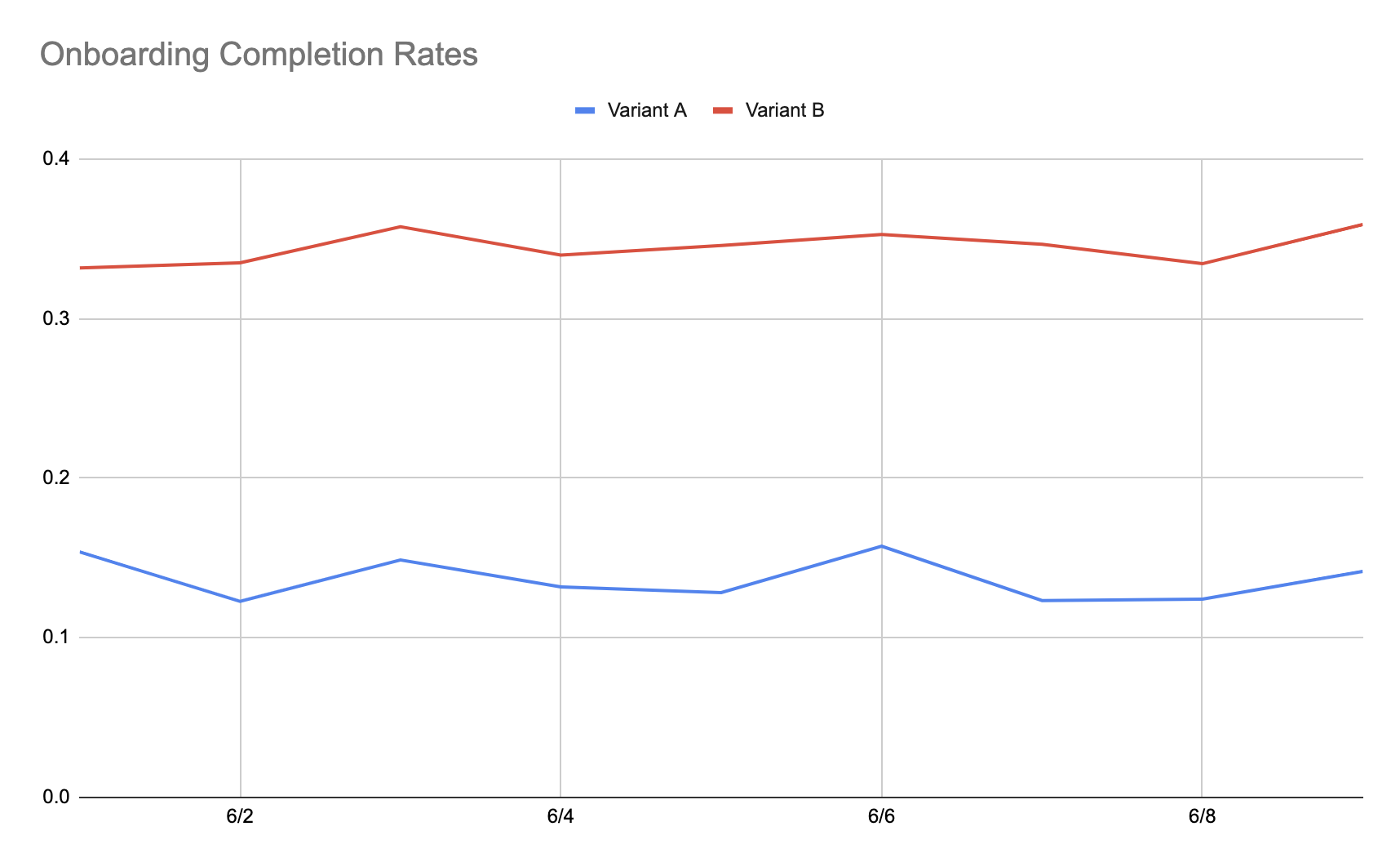
With statistical significance reached, the winning variant was implemented. Now, Couchsurfing has seen a 21% increase in prospective members who went from browsing the homepage to becoming couchsurfers. This means thousands of new signups every week.